
How to Choose the Best Fonts for Your Unique Brand

Choosing the right fonts is an important part of creating a strong brand identity. Fonts can send a message about the style and personality of your brand, so start by considering the emotions and values you wish to evoke. Are you aiming for modern and minimalist? Or maybe you’re going for traditional and ornate. Is your brand fun and playful or serious and professional? Either way, the ideal fonts will reflect your unique style.
I recommend choosing one or two (three at most) fonts that complement each other, and sticking with them wherever you plan to show up, (website, social media, print materials, etc.). Consistency goes a long way in conveying professionalism and will help you stand out from your competitors. (More on how to maintain cohesive branding here.)
Think about your target audience and take them into account when choosing your font(s). By understanding the age, location, and interests of your customers, you can tailor your brand to resonate with them. Different demographics may have different preferences that you’ll want to appeal to, so choose fonts that complement your brand's overall aesthetic.

You’ll also want to take readability and legibility into consideration, which refer to how easily a font can be read. Style, size, and spacing all contribute to the readability and legibility of your text. This is especially important when it comes to the context in which your font will be used. For instance, Sans Serif fonts are generally considered easier to read on screens, while Serif fonts are often favored for print materials. So keep in mind where your text will be presented.
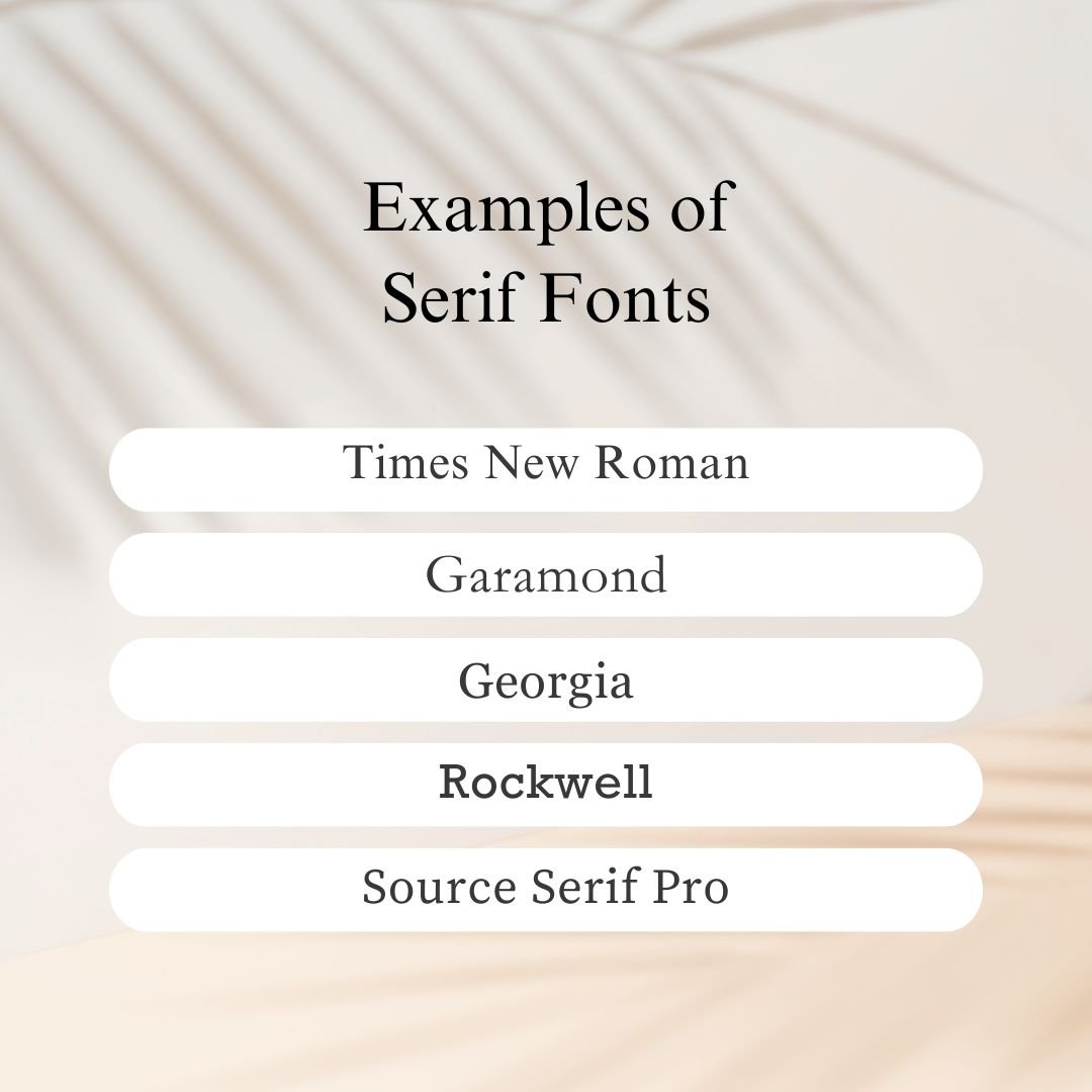
The four most common types of fonts include Serif, Sans Serif, Script, and Display. In the first image below, notice the Serif fonts have little feet (small lines or flourishes) on the ends of each letter. Serif fonts are typically recognized as classic or traditional and are easy to read.
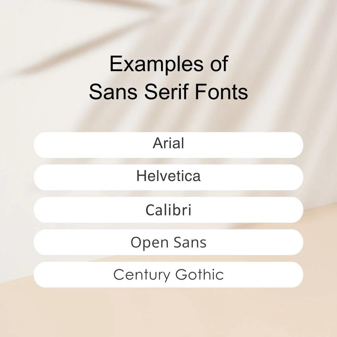
Sans Serif fonts do not have little feet. They have smooth edges and clean lines and are therefore viewed as modern or minimal. These fonts are also easy to read and pair well with most other font types. Some options have both Serif and Sans Serif versions.
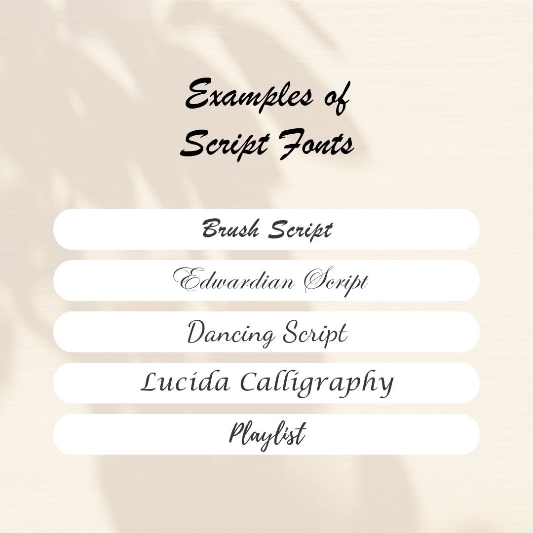
Script fonts are cursive typography that may be designed to mimic handwriting, calligraphy, or paint-brushing. These stylistic fonts are decorative and eye-catching, but can also be harder to read, so use them sparingly.
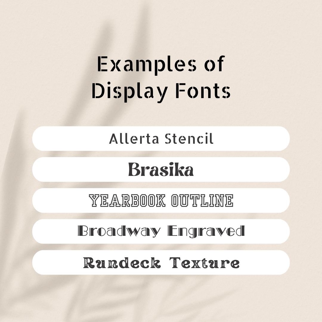
Lastly, Display fonts are those that contain specialized elements such as irregular, engraved, stenciled, or outlined designs. They are typically bold and attention-grabbing and are therefore great for making text pop. Like Script fonts, it’s best not to overuse them. I recommend reserving them for headers and titles or text you want to really stand out.
The fonts you choose can be a powerful tool for communicating your brand's message, so play around with different pairings and take the time to choose wisely. By carefully selecting a font that aligns with your brand's personality and values, you can create a cohesive and impactful visual identity that will resonate with your audience.
Related Posts


Written by Tabitha Stevenson, Squarespace Web Designer & Founder of Mindful Design Solutions
I’m passionate about helping entrepreneurs and small businesses stand out online with engaging and effective Squarespace websites. You can learn more about me here.