
Choosing the Best Colors for Your Website - And Palettes You Can Steal Right Now
Choosing the right color palette for your website will help you develop a cohesive brand identity. Your chosen colors should align with your branding to effectively communicate who you are and what you do. This helps to establish not only visual appeal but also recognition and trust.
For creative types, playing around with color can be fun. Regardless of whether you have an eye for design or not, it helps to understand basic color theory principles. Or simply skip to the bottom of this post to snag any of the palettes I created below.
Color theory is the study of how colors relate to each other based on the color wheel. Think of the color wheel as a visual guide for understanding how primary, secondary, and tertiary colors interact with one another. Color science is a complex topic, but these color schemes will help you understand how to create a visually appealing palette.

There are seven basic color schemes to consider:
Monochromatic - varying shades and tones of a single color
Analogous - three colors that are next to each other on the color wheel
Complementary - colors from opposite sides of the color wheel
Split complementary - colors on either side of the one opposite your base color
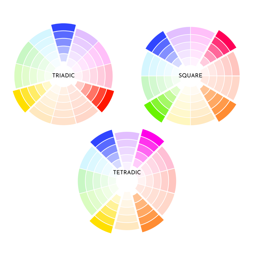
Triadic - hues that are equally spaced around the color wheel
Square - four colors evenly spaced (creating a square) on the color wheel
Tetradic - four colors spaced like a rectangle

It’s also important to know that colors can evoke emotions and even elicit actions. There have been numerous studies conducted on the psychology of colors and their influence on human behavior and decision-making. References to color science can be found dating all the way back to the 1400’s.
Keep these concepts in mind when considering the message you intend to communicate to your audience. For example, blue is often perceived as professional and dependable. Black tends to feel luxurious or sophisticated. Purple may evoke wealth or spirituality. Green is a great color for conveying health or prosperity. Yellow usually imparts warmth and happiness. We often think of pink as creative or quirky. While orange is typically adventurous or energetic. Interestingly, red seems to be the most controversial color, conveying excitement or passion to some, and anger or danger to others.
You’ll also want to consider how your chosen colors will look across whatever mediums you’ll be utilizing, such as digital and print. Make note of the exact color codes for each color in your palette to ensure consistency. This includes HEX (hexadecimal) for digital and CMYK (cyan, magenta, yellow, black) for print.
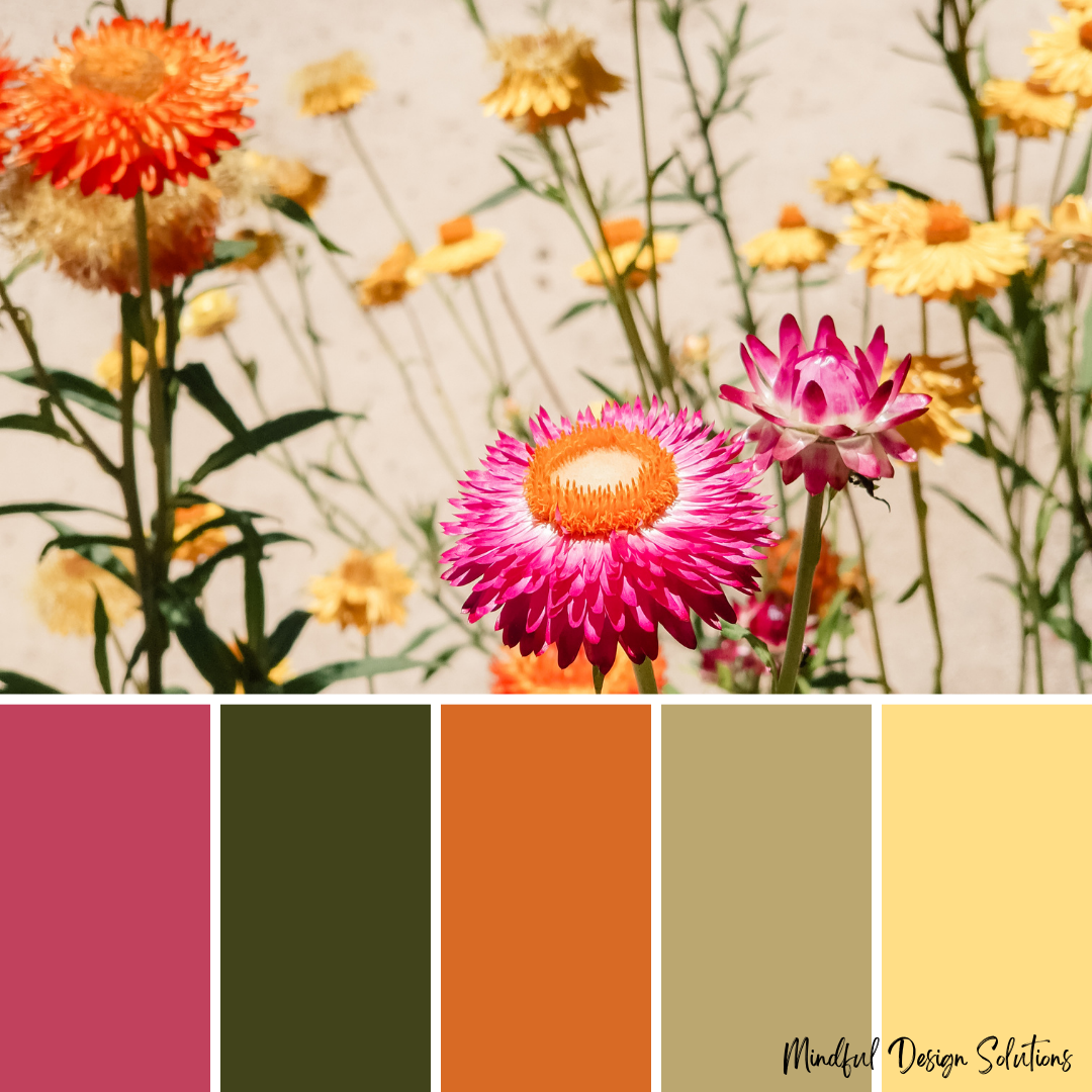
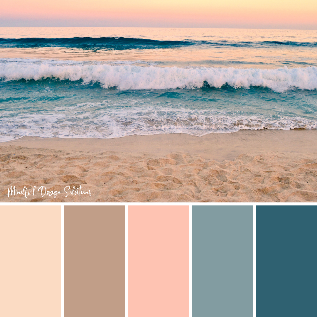
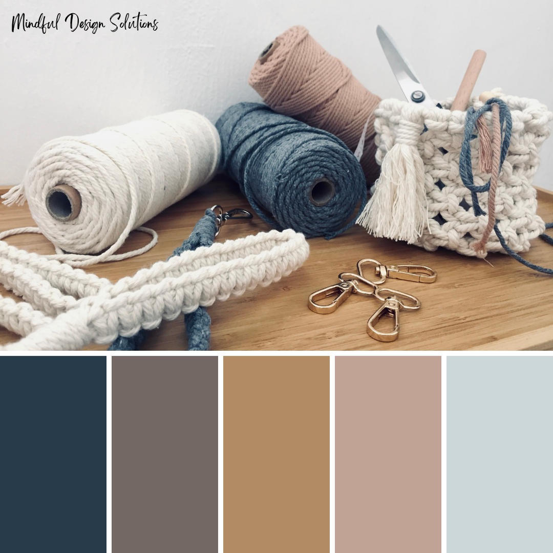
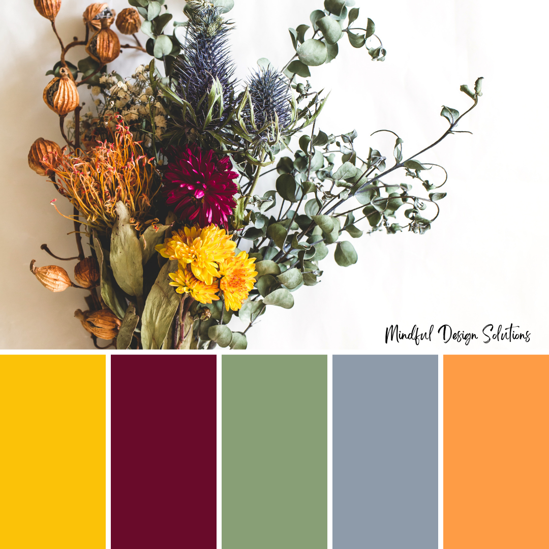
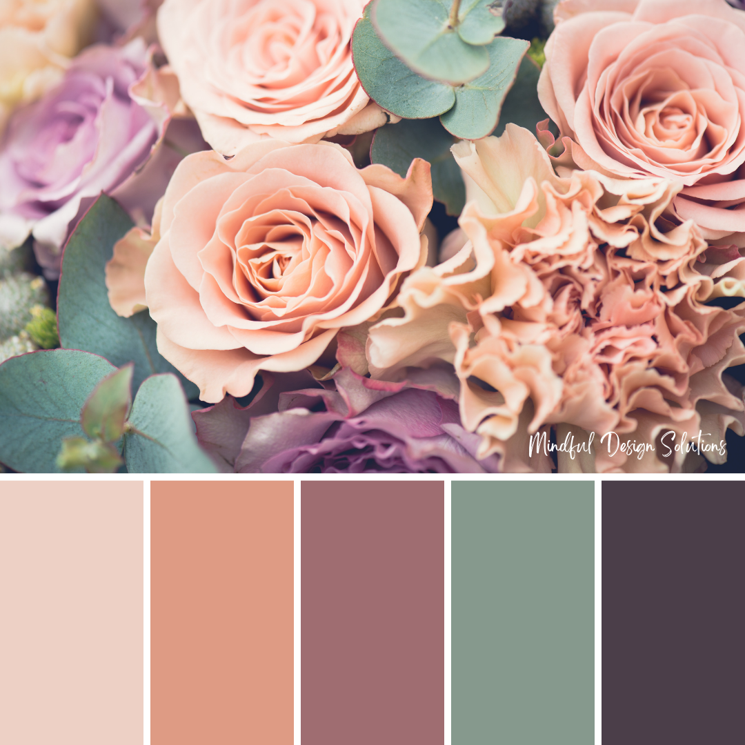
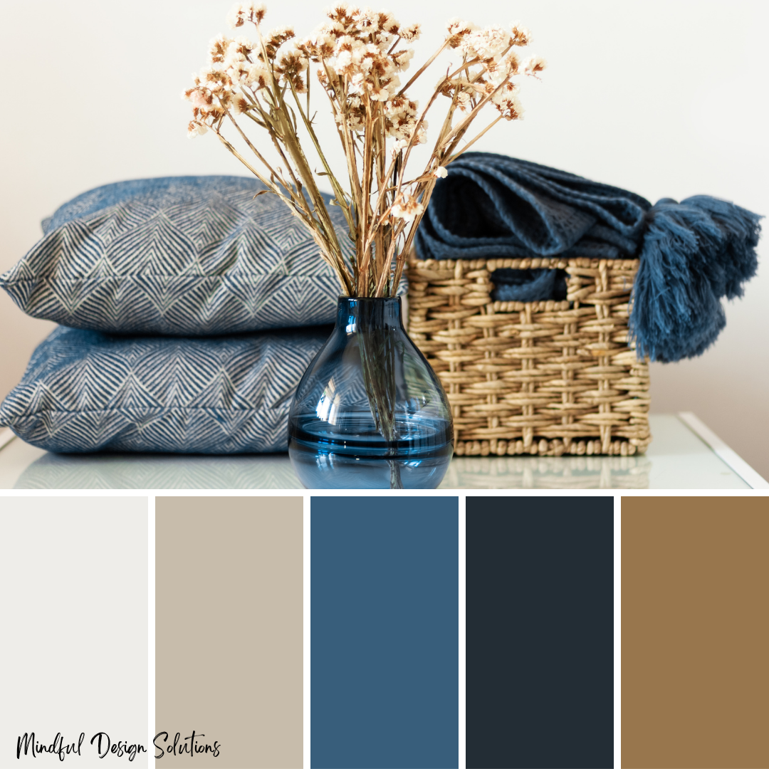
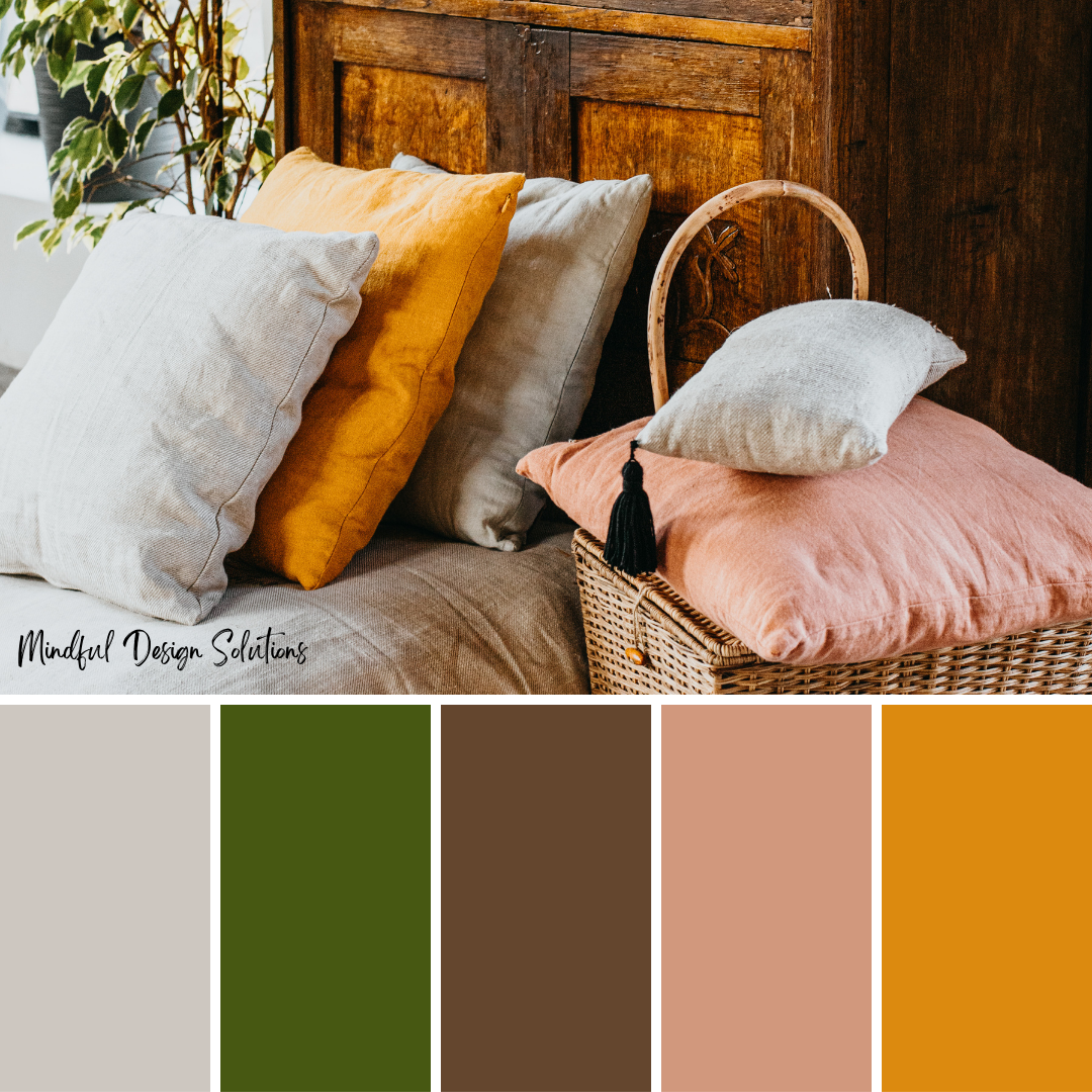
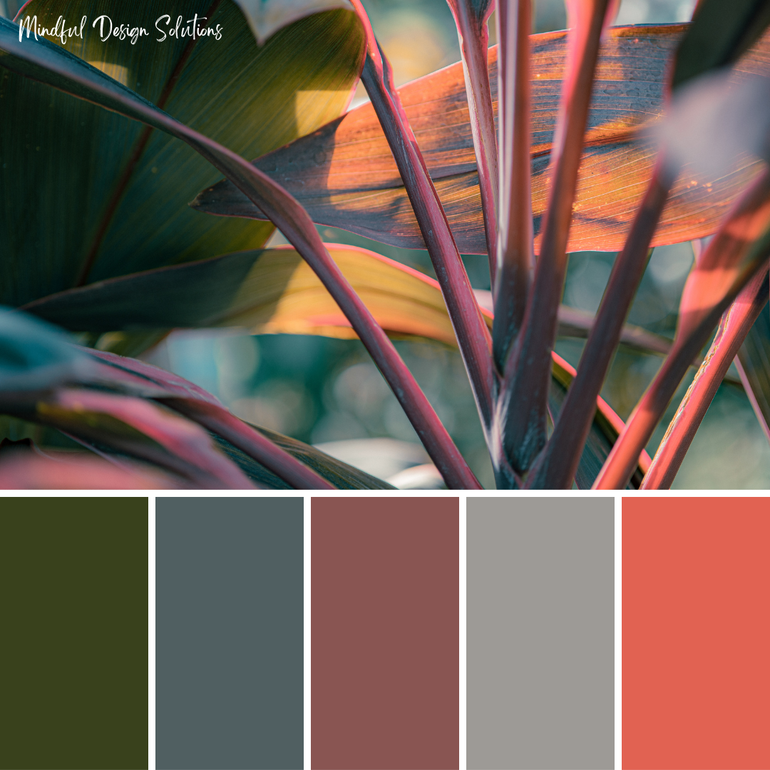
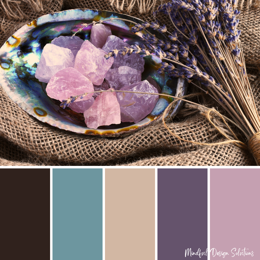
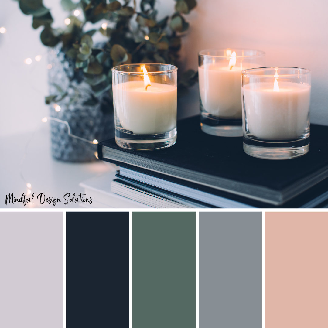
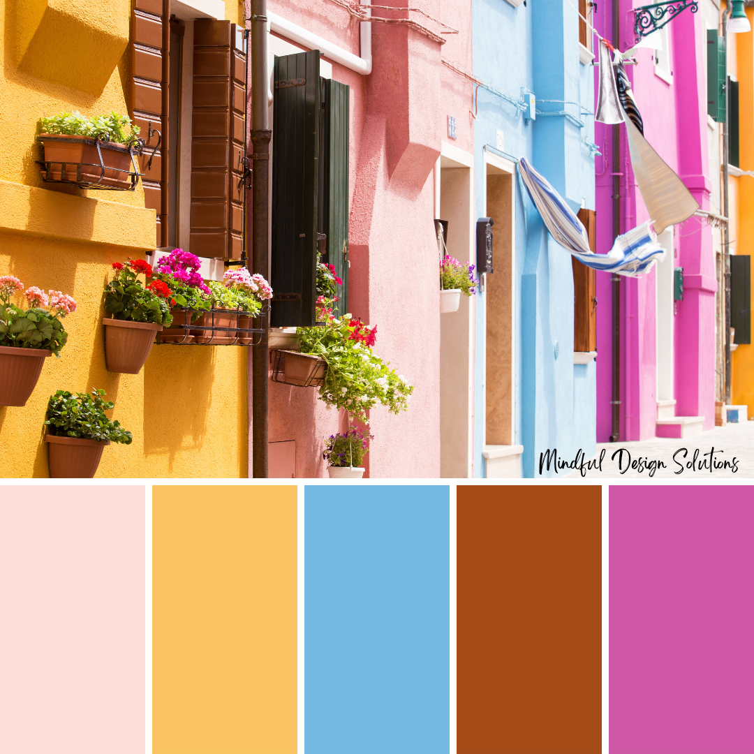
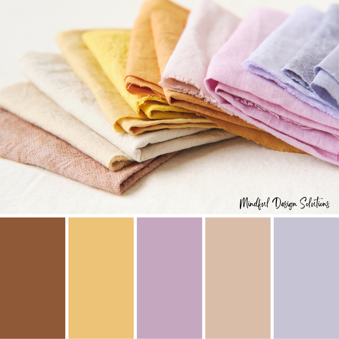
Grab any of the palettes below to use for your branding or on your website. Or use them to inspire a custom palette of your own design!


Related Posts


Written by Tabitha Stevenson, Squarespace Web Designer & Founder of Mindful Design Solutions
I’m passionate about helping entrepreneurs and small businesses stand out online with engaging and effective Squarespace websites. You can learn more about me here.